
Malwarebyte Anti-Malware has landed and is now rolling out as an update. The biggest change with this version is the user interface redesign. We summarized much of the criticism and shared mock-up photos of the coming redesign back in October. While the UI redesign was originally aiming for a December release, it appears the delay was worth it to provide a refined product.
While the old interface of MBAM 2.0 was frequently compared to fake AV by the technical crowd, MBAM 2.1 brings a simpler interface that also works for the novice user. The banner ads are gone from the Dashboard, as are the garish colors and alarming colors for minor notifications from the program. Cleaner, minimalist banners are on the bottom of the scan progress window but are not distracting and don’t feel like they’re trying to upsell you.
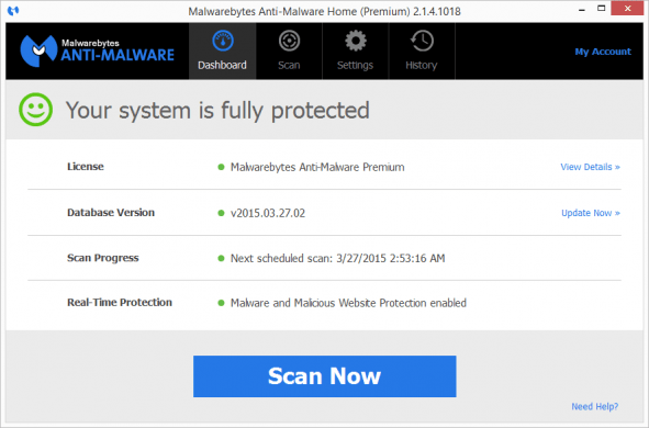
Below is a screenshot from my own MBAM Premium subscription in its happy state.
The process to initiate a scan has also been re-worked to be more straight-forward without jumping ahead.

The scan progress window clearly shows each step of the scan while providing useful information as it moves toward completion.

To compare these new screenshots to the MBAM 2.0 look, see our October 2014 article ‘A new UI for Malwarebytes Anti-Malware in the works‘.
The announcement for Malwarebytes Anti-Malware 2.1.4 was made last week and new downloads were updated. Existing installs have been getting update prompts this week. The following improvements, issues fixed, and known issues were listed in the announcement release notes. It indicates that there were plenty of changes made under the hood to keep Malwarebytes a great tool along with a new coat of paint.
Improvements:
- Brand new UI design! Much cleaner look with a toned-down color scheme.
- Improved scan flow – all scans now automatically check for and apply the latest database updates so you’re always scanning with the latest protection. (Exception: this will not occur with Scheduled Scans if you have the option to “check for updates before scanning” disabled.)
- Simplified Quarantine flow – threats detected are pre-selected for removal and users are presented with a single “Remove Selected” button. Clicking “Remove Selected” quarantines all checked items. If you uncheck any threats you will see a new dialog asking what action should be taken on the unselected items: Ignore Once, Ignore Always, Cancel.
- Improved malware protection capabilities, including enhanced rootkit detection and removal.
- The Minimize button now minimizes the main program window to the taskbar instead of the tray.
- The default display timeout for notifications was changed to 3 seconds instead of 7 seconds.
- The default value for “Show notification after successful update” is now set to “Off” for all scheduled updates.
- Removed the informational message from the main dashboard view.
- Remove support for Thai language due to quality issues with the translation.
- Installation of a Consumer/Home version of Malwarebytes Anti-Malware over a Business version is now blocked.
Issues Fixed:
- Admin users should no longer see a prompt to login as admin to perform a program upgrade.
- Fixed issue where the web protection service (MWAC) was not restarting properly.
- Fixed numerous issues with scheduled scans, including showing the correct date for “Next scheduled scan” on the dashboard.
- Fixed issue where mbamscheduler was starting on boot when Malwarebytes Anti-Malware was set not to start with Windows.
- Fixed issue where any non-English language selected during installation would not be applied after installation.
- Fixed issue where Malwarebytes Anti-Malware did not always automatically update the database on installation.
- Fixed an issue where the “Delay Protection at startup for 15 seconds” setting showed as enabled, but was actually disabled. (We recommend reviewing this option to ensure it is configured as you intended.)
- Fixed issue where “Error Code 6” displayed at the end of scans.
- Fixed issue on Windows XP where scheduled scans on reboot would not start if the “Enable self-protection module” was checked.
- Malwarebytes Anti-Malware now honors self-protection settings detected from a previous installation.
- Fixed issue where context menu scan was not honoring user selection under detection and protection setting.
- Several issues with notifications were fixed.
- Several enhancements were made to the user interface to address accessibility issues.
- Several UI and user experience enhancements implemented.
Known Issues:
- Certain elements of the user interface, such as tables, do not support screen readers. We’ll continue to improve our support for accessibility-related items over the next several releases.
- The version information displayed the Protection Log for program updates is displaying an incorrect fourth digit. The fourth digit represents the build number, and if curious, you can find the exact build on the About screen in Settings.
- The informational messages that display during scans (and on the Scan Results page in the Free version) are only available in English for the time being. We hope to provide translations for these in a future release. There may be other minor issues around missing translations, which vary by specific language.